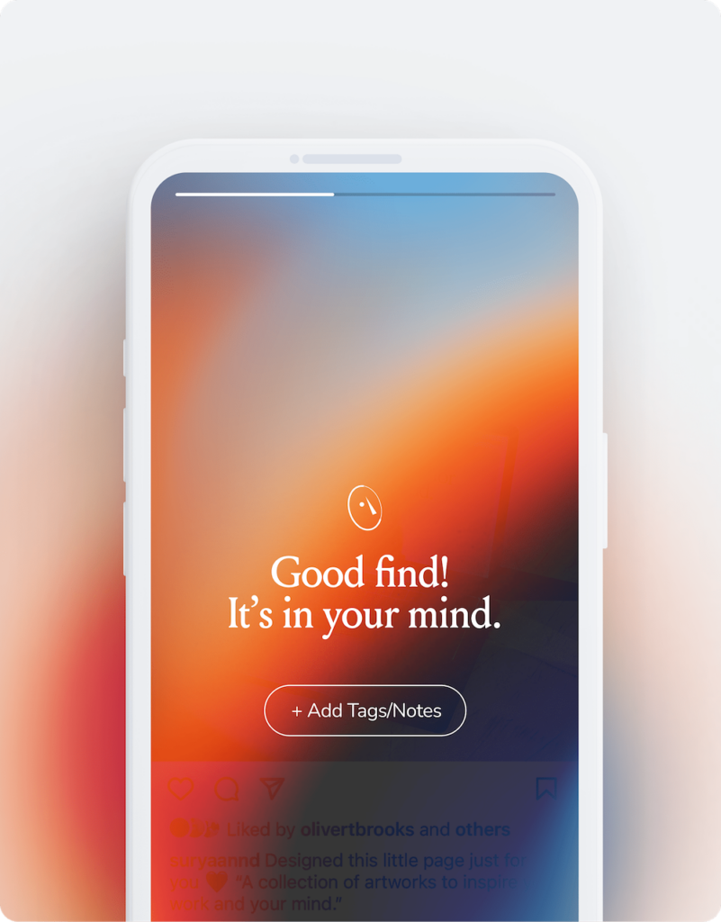
If you saved something with the new mymind iOS app recently, you saw it.
✦ The new share panel ✦

We had a few goals when designing it:
✦ Make it delightful, so you feel a little kick of pleasure every time you see it. It should be satisfying to save something.
✦ One tap and it's in your mind. No clutter, no dropdowns, no extra steps or “work.” It's frictionless, so you can save and move on.
✦ Easy dismissal. The share panel closes automatically (you'll see a countdown at the top) but can be dismissed immediately by swiping down. You can intercept the countdown to add tags or notes if needed. But by default, you have to do nothing.
We believe the small stuff makes a difference, and you'll see that in every interaction with mymind. We hope the new share panel makes your mind more satisfying, seamless and fun to use.
–
P.S. Android updates coming soon, for our beloved Android members!
P.S.S. If you haven't already, would you take a moment to rate & review the new app on the app store? We've been checking our rating every morning like kids on Christmas. Thank you to those who left such kind reviews already – we read every single one of them.

 The work of Italian designer Vico Magistretti Right click an image or long press on mobile to add …

