We believe software should stay out of the way and let you focus on what matters – which isn’t software.
In that spirit, we follow these 3 design principles for everything we build:
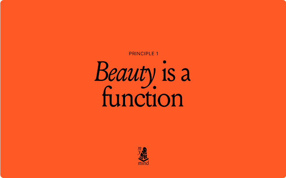
mymind principle #1

Design that pleases the mind serves it. If we strive to make it beautiful, we automatically make it useful.
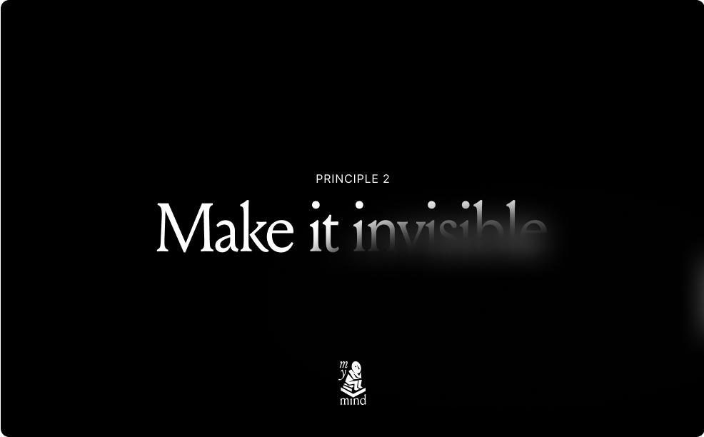
mymind principle #2

The less you think about mymind, the better. We believe in clutter-free experiences without dropdowns, filters and the usual demanding UI you’ll find in other apps.
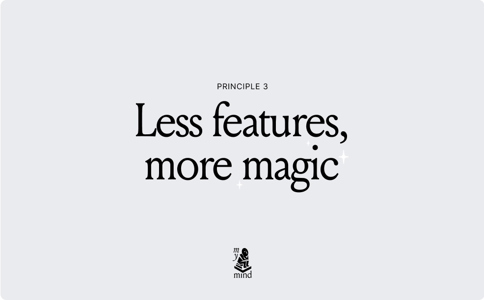
mymind principle #3

We’re not concerned with churning out more features and functionality. Your mind just works. It doesn’t really matter how. It does the work for you, not the other way around.
_
We could easily add more features and options to keep up with other tools. And that might make some people happy in the short term. But a few years down the line, it would only leave us with a bloated, unusable tool far from our original vision.
Which is why we filter every decision we make for mymind through these design principles, every day. To create a tool that fulfills its purpose.
Nothing more, nothing less.


 The Charles and Ray Eames House Right click an image or long …
